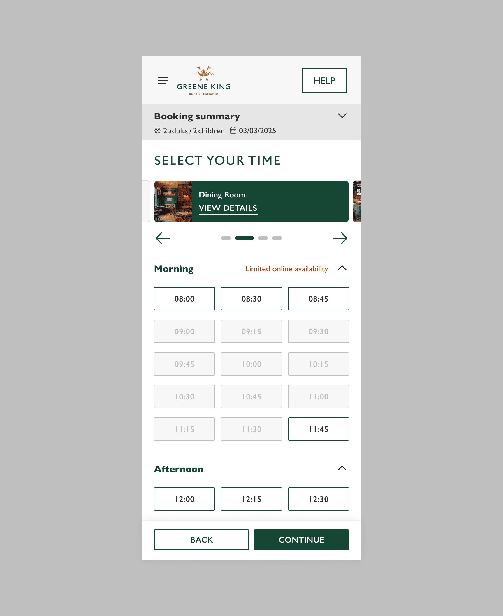
As part of a large scale digital transformation, Greene King, a major UK pub retailer, tasked us with redesigning the entire online booking experience across its portfolio of pub brands. I led the UI on the booking flow overhaul, focusing on system scalability, brand flexibility, and seamless UX for a broad range of booking types. From solo dinners to festive events and corporate gatherings, the new system had to support it all with ease.
Agency
VML
My role
UI design
Location & year
UK, 2025
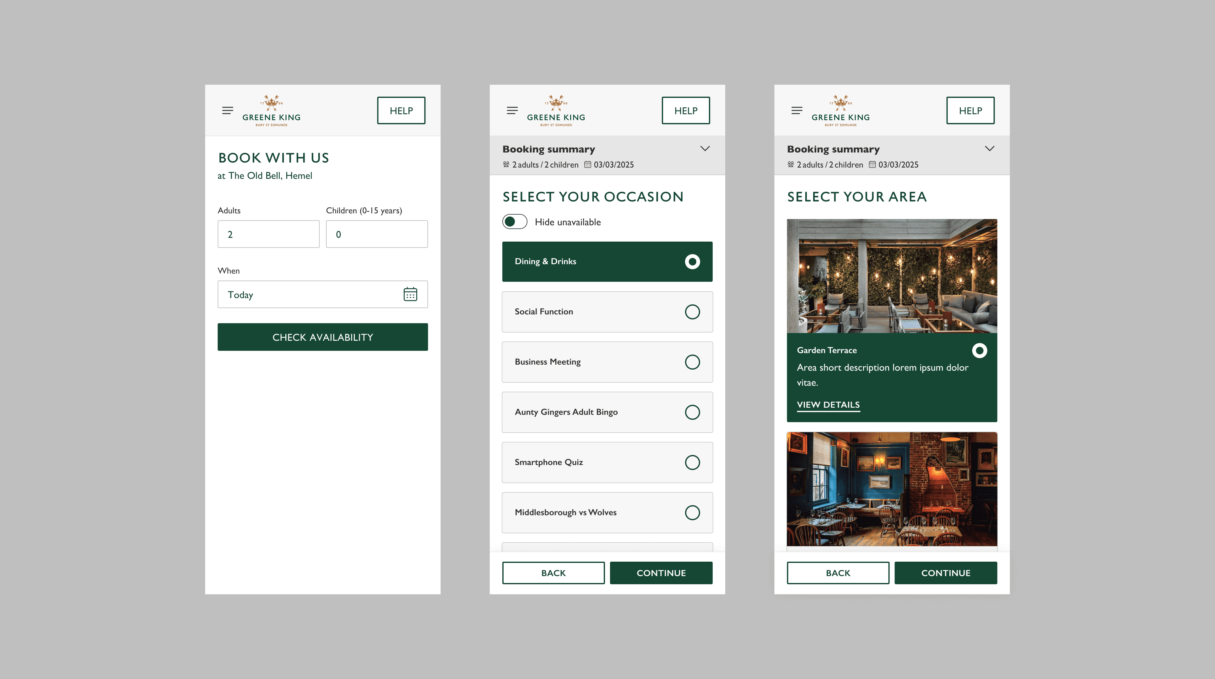
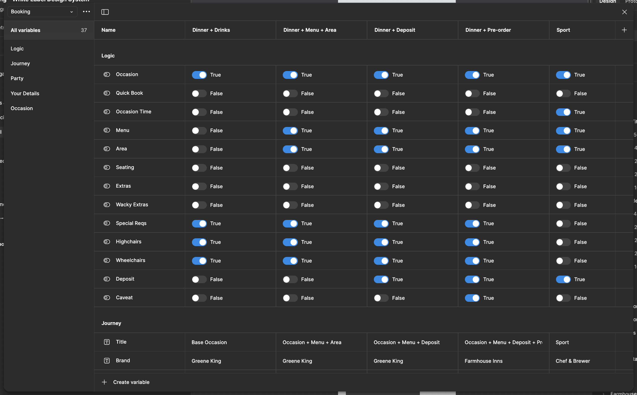
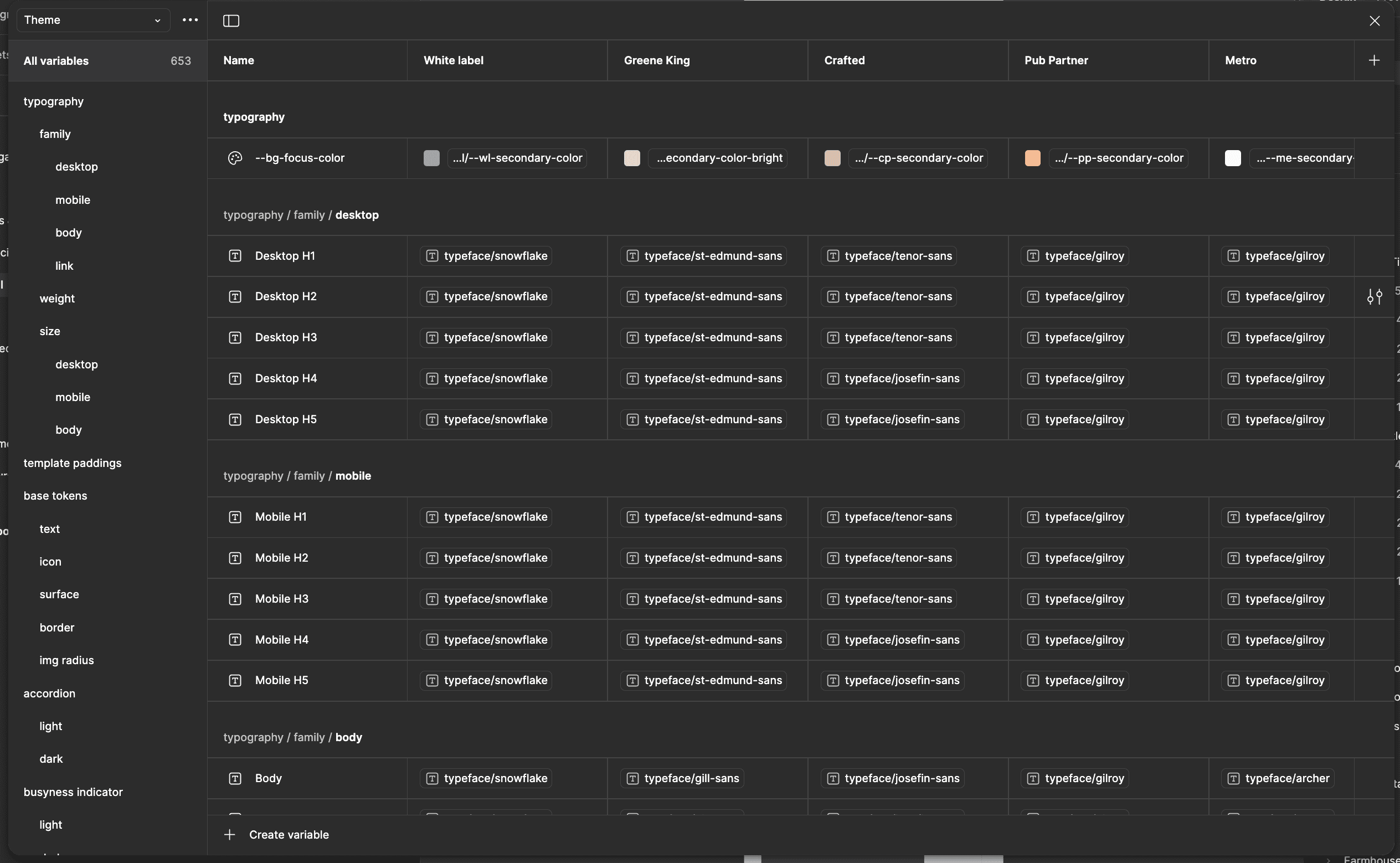
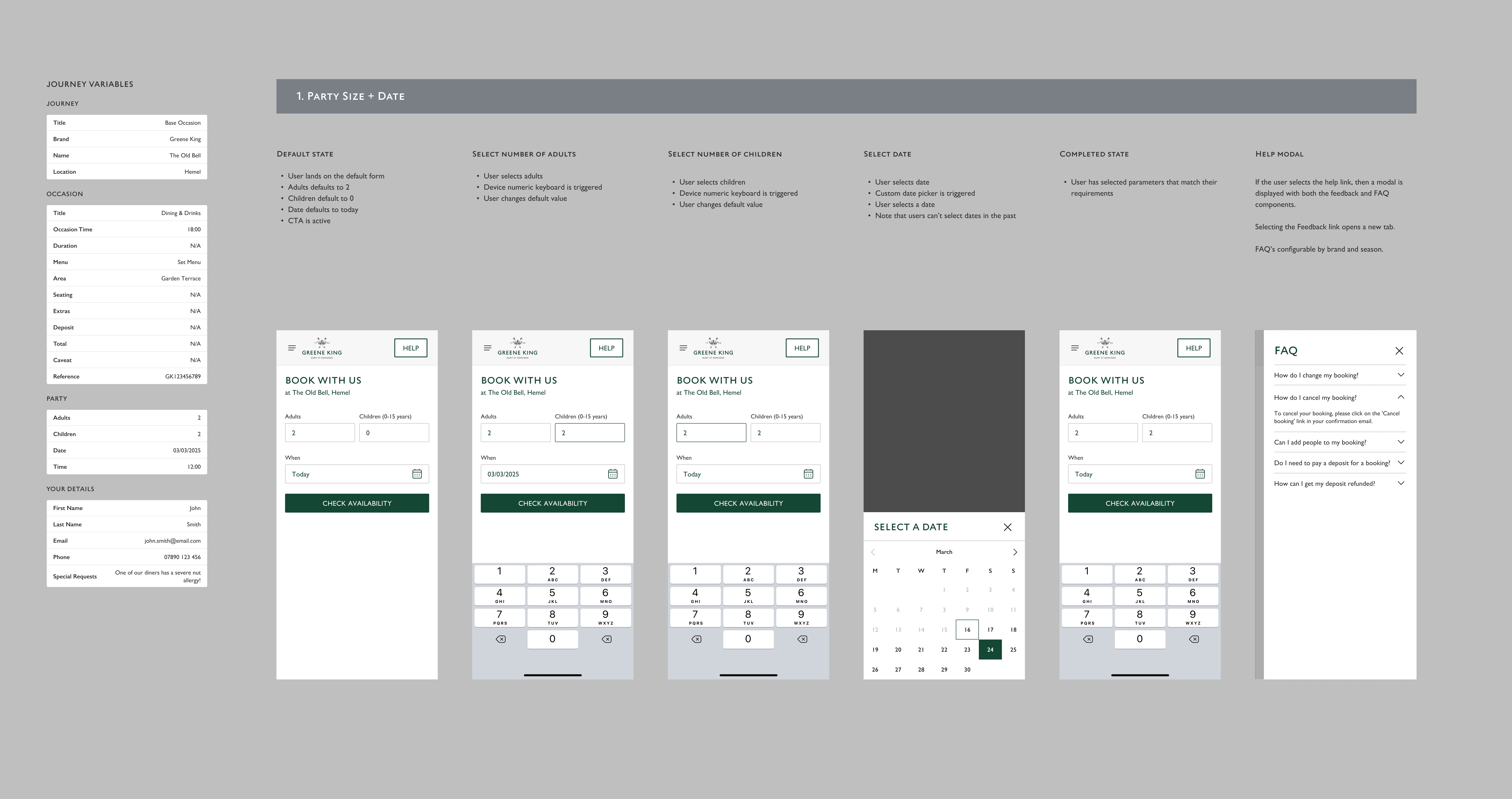
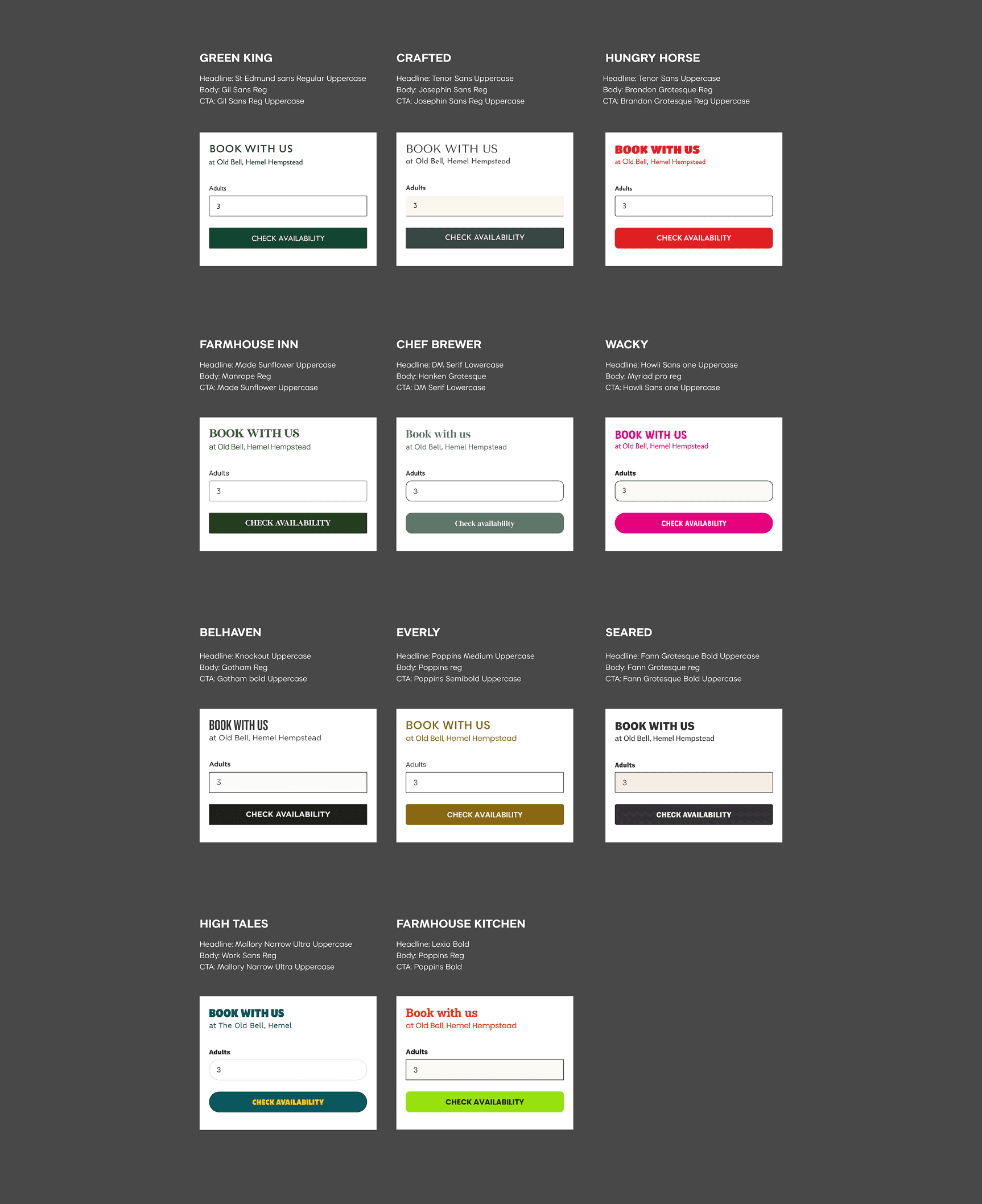
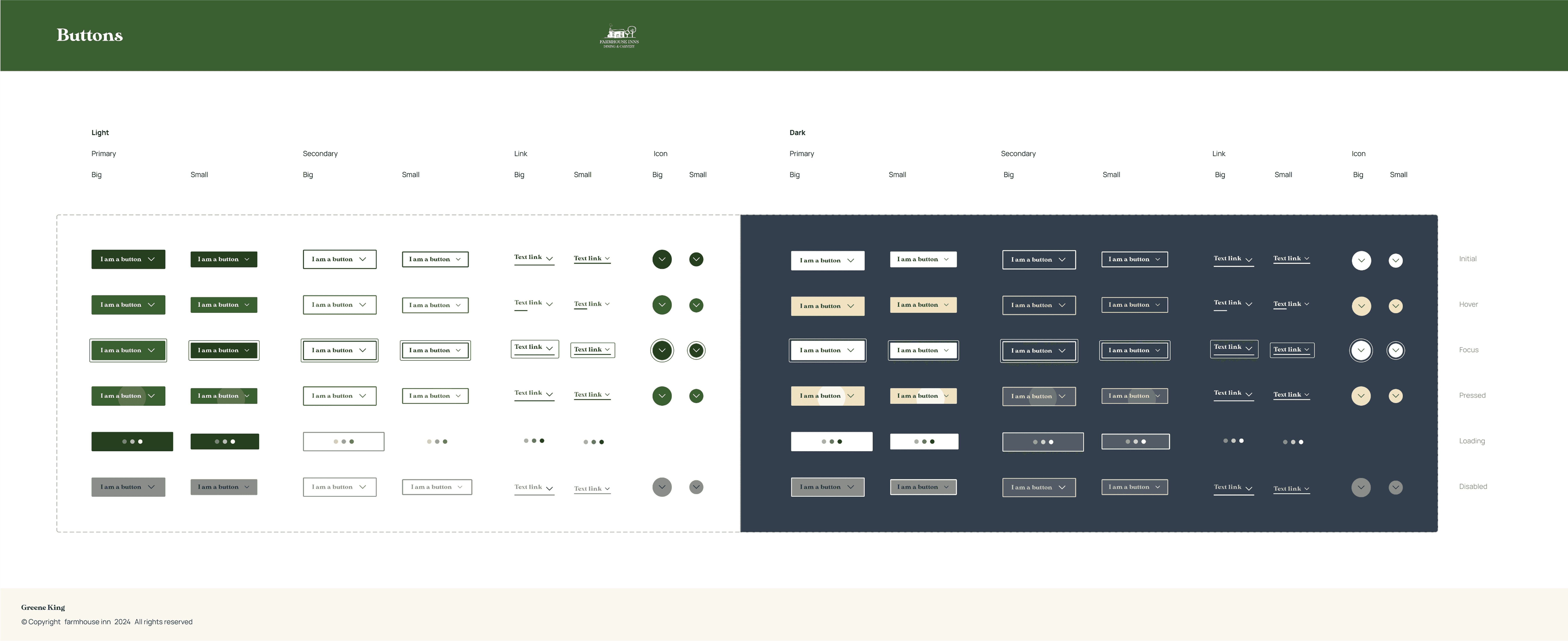
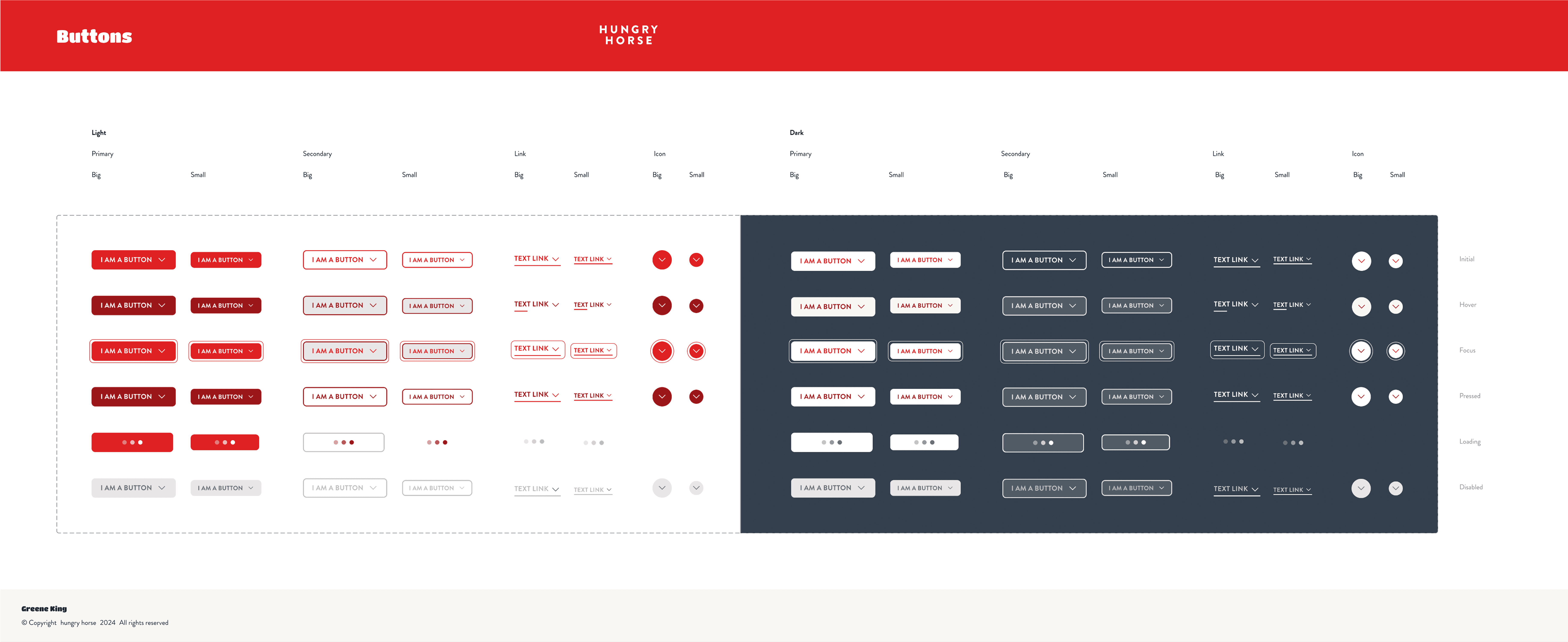
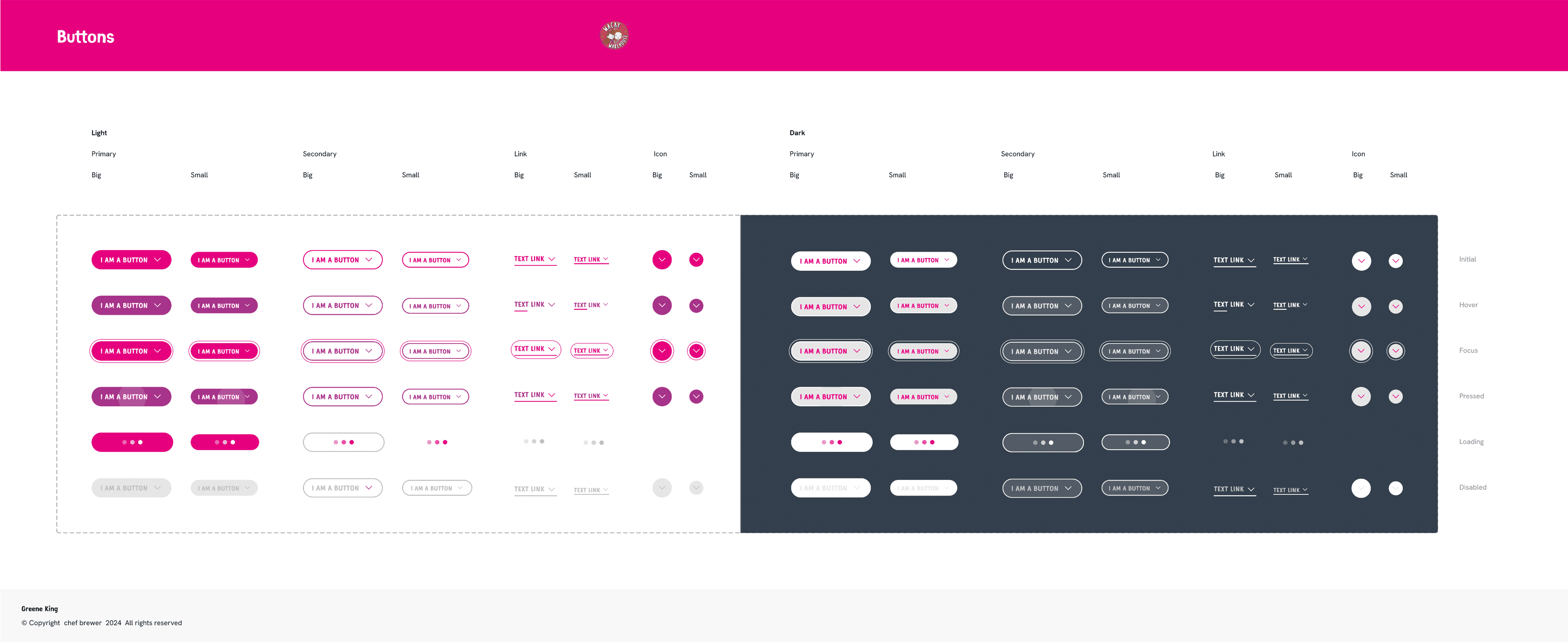
At the heart of the project was a fully tokenised design system, built to accommodate multiple brands under the Greene King umbrella. I created reusable, scalable components in Figma, ensuring we could roll out consistent UX patterns while tailoring the visual style to each brand.
At the heart of the project was a fully tokenised design system, built to accommodate multiple brands under the Greene King umbrella. I created reusable, scalable components in Figma, ensuring we could roll out consistent UX patterns while tailoring the visual style to each brand.
Key Design Skills
Interactive prototypes were developed to communicate flow logic and interactions clearly to stakeholders. These allowed for smoother approvals and alignment across teams.
Complex Booking Requirements
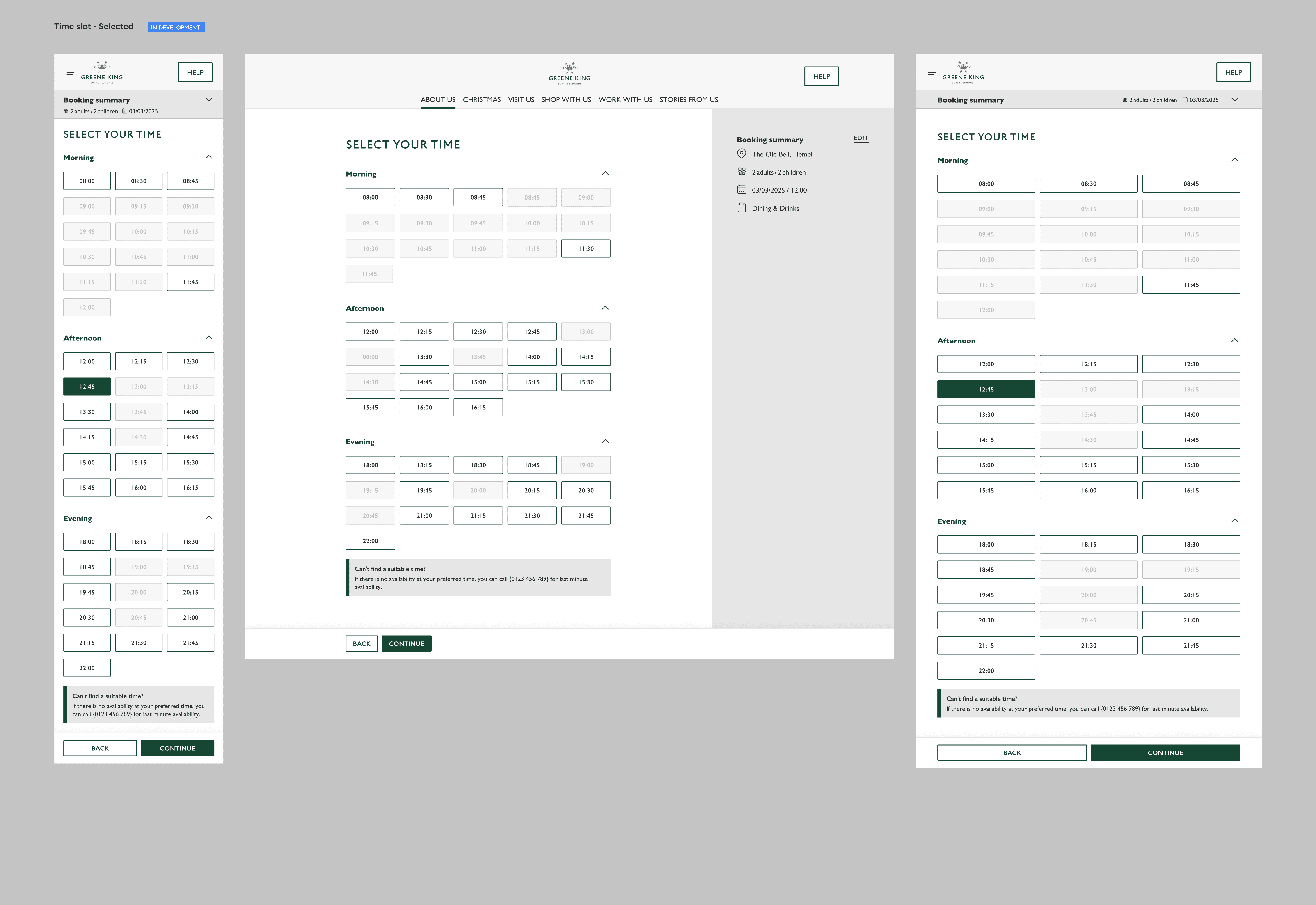
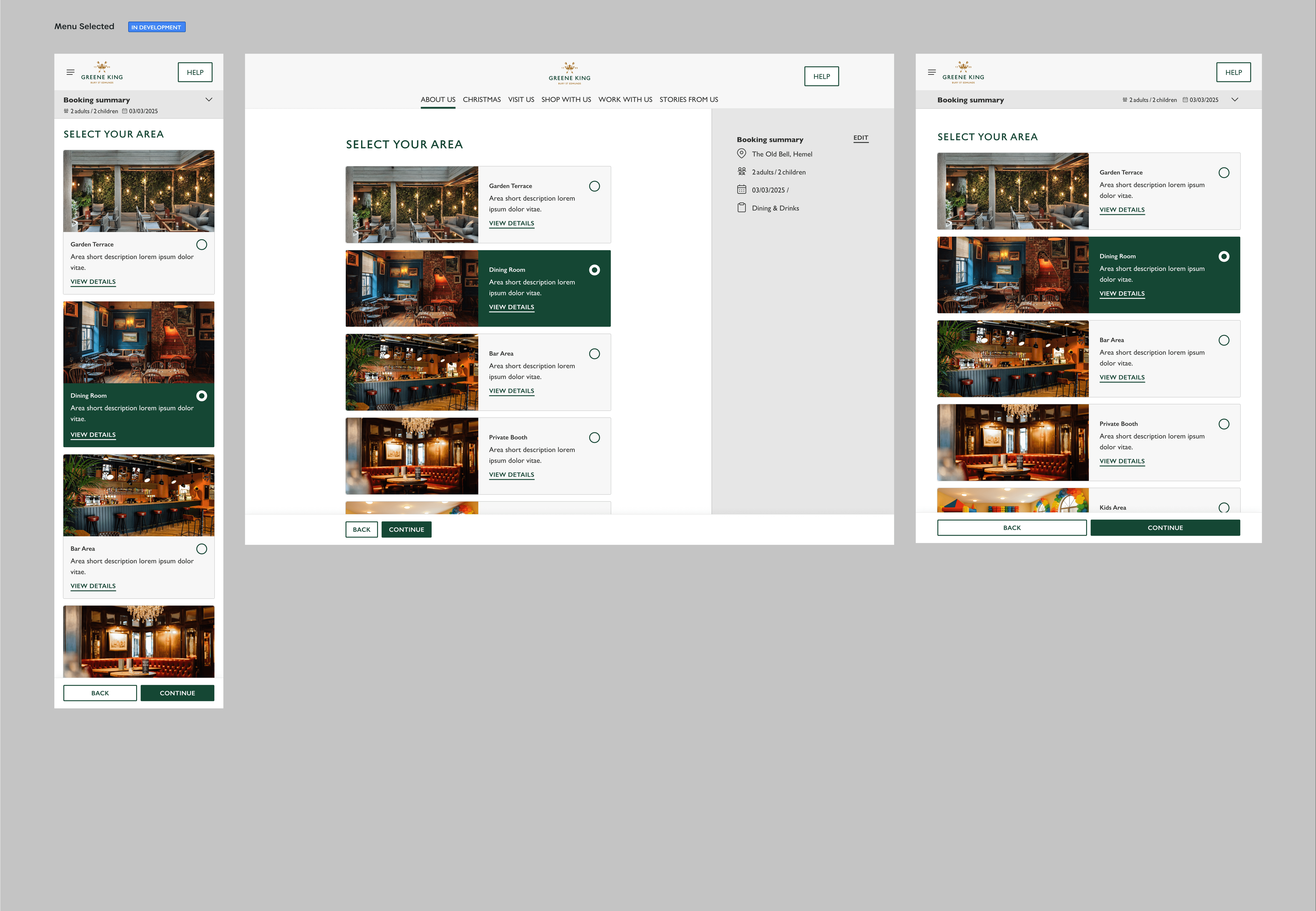
With many unique booking scenarios, we created modular flows that adapted based on the booking type. This helped reduce friction and improve clarity for users.
Scalable Brand Integration
Tokenisation allowed us to adjust colours, typography, and component styling across brands without rebuilding layouts from scratch.
Stakeholder Buy-in
Prototypes played a critical role in selling ideas internally and gaining client confidence early in the process.
Key Design Skills
Interactive prototypes were developed to communicate flow logic and interactions clearly to stakeholders. These allowed for smoother approvals and alignment across teams.
Complex Booking Requirements
With many unique booking scenarios, we created modular flows that adapted based on the booking type. This helped reduce friction and improve clarity for users.
Scalable Brand Integration
Tokenisation allowed us to adjust colours, typography, and component styling across brands without rebuilding layouts from scratch.
Stakeholder Buy-in
Prototypes played a critical role in selling ideas internally and gaining client confidence early in the process.

Cross-Brand Adaptability
Each pub brand had its own typographic style and unique colour palette. Applying these directly to a shared component system risked breaking layout consistency, creating accessibility issues, or causing clashes in interactive elements like buttons and form fields.
Brand tests
I stress-tested the components across all 12 brands using real content. This informed the development of responsive, flexible grid containers and scalable components that gracefully handled different content lengths.
matching assets with different brands
to preserve consistent layouts and interactions while allowing surface-level visual variation per brand.
Collaborating with Devs
i had to work closely with development teams to make sure the new flows and designs worked with their online tools.


Let’s work
together
Email me
Let’s work
together
Email me