Staysure, one of the UK’s leading travel insurance companies, sought a comprehensive brand redesign to modernize their identity and enhance their digital presence. They needed new colors, a refreshed logo, and digital guidelines that would propel the brand forward. My role was pivotal in crafting a visually striking and cohesive digital-first experience, ensuring the new identity resonated with their target audience.
Staysure, one of the UK’s leading travel insurance companies, sought a comprehensive brand redesign to modernize their identity and enhance their digital presence. They needed new colors, a refreshed logo, and digital guidelines that would propel the brand forward. My role was pivotal in crafting a visually striking and cohesive digital-first experience, ensuring the new identity resonated with their target audience.
My role
UI & brand designer
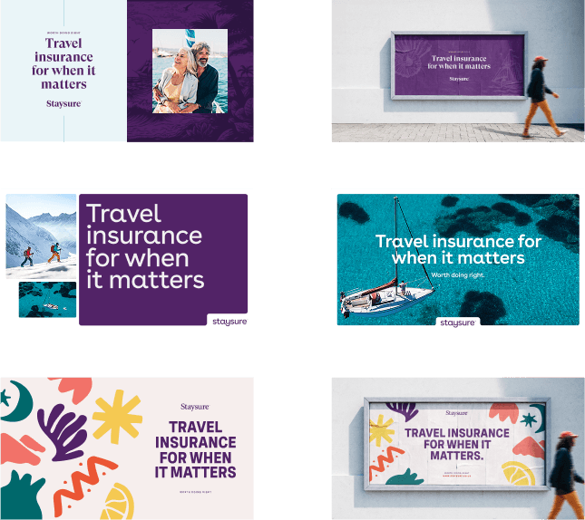
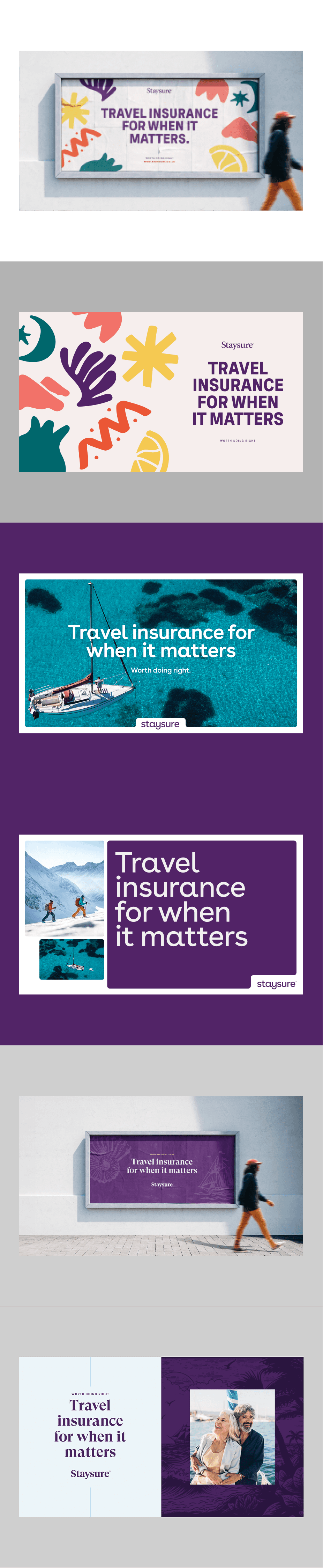
We presented Staysure with three distinct brand look & feel routes, each exploring different visual directions. They selected a clean and bold digital-first approach that utilized vibrant colors and powerful imagery to convey trust and reliability.
We presented Staysure with three distinct brand look & feel routes, each exploring different visual directions. They selected a clean and bold digital-first approach that utilized vibrant colors and powerful imagery to convey trust and reliability.
Three brand routes were presented to the client.
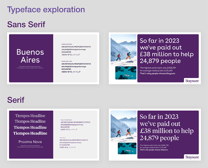
One the route was chosen we explored font options.
Next steps
Once the brand look & feel had been established, we took it across all digital touchpoints to stress test the design.
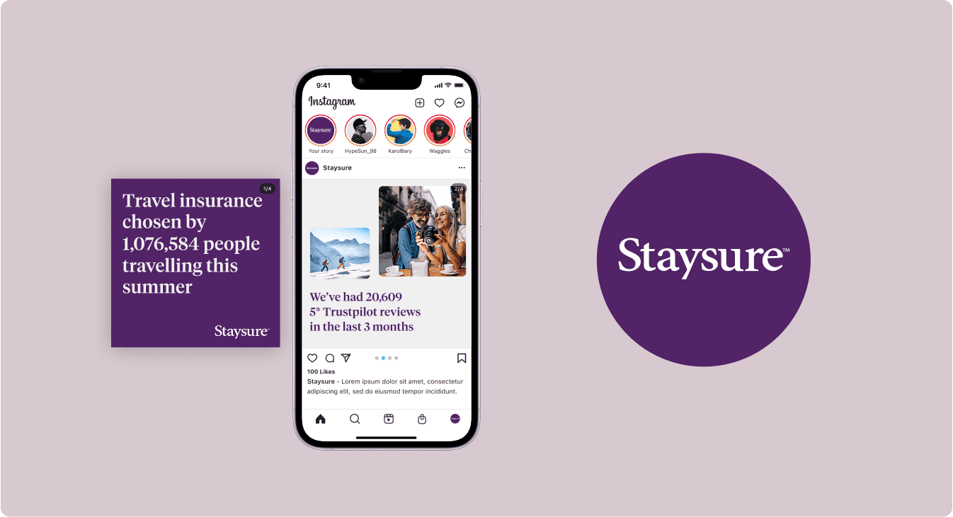
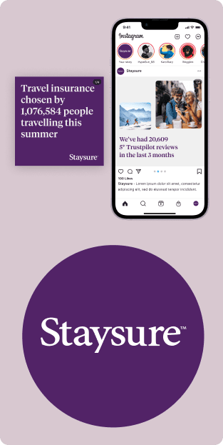
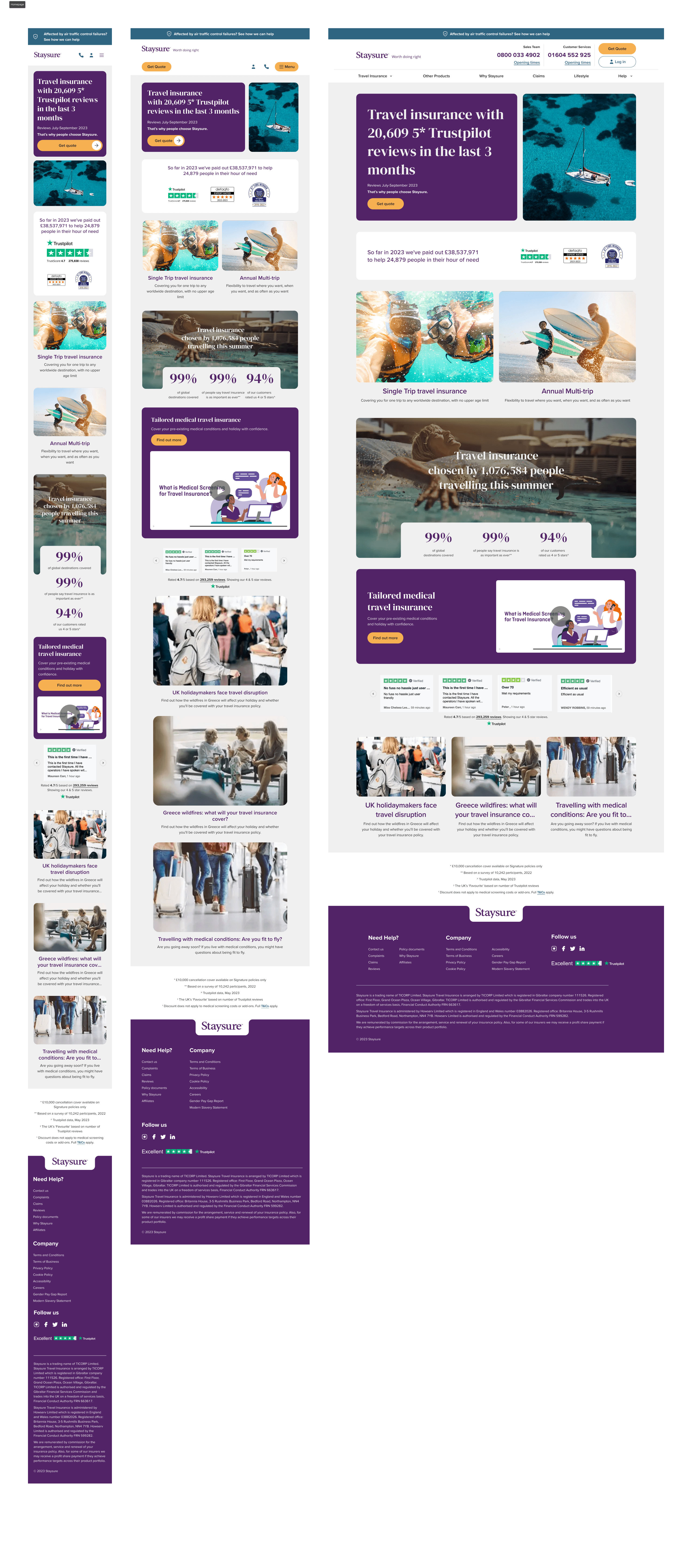
The brand had to work across multiple locations. We took time to explore how it would work across, mobile, web, instagram, OOH banners and more.
The chosen route emphasized a modern and sleek aesthetic, designed to be highly adaptable across digital platforms. This approach ensured consistency and engagement across all touchpoints.
To streamline development and maintain brand consistency, we built a fully tokenized design system in Figma. This modular framework allowed for efficient updates and scalability as the brand evolved.
Next steps
Once the brand look & feel had been established, we took it across all digital touchpoints to stress test the design.
The brand had to work across multiple locations. We took time to explore how it would work across, mobile, web, instagram, OOH banners and more.
The chosen route emphasized a modern and sleek aesthetic, designed to be highly adaptable across digital platforms. This approach ensured consistency and engagement across all touchpoints.
To streamline development and maintain brand consistency, we built a fully tokenized design system in Figma. This modular framework allowed for efficient updates and scalability as the brand evolved.
Digital OOH examples. here you can see the use of the tiles to create collage layouts. We created a set of these layouts which could be mix and matched across all touchpoints. A clean and modern approach with rounded corners and a stage for the logo created a pleasing layout.
We looked at how the brand would look across social
Challenges & Solutions
The main challenge was aligning the new, bold identity with Staysure’s established reputation while maintaining a user-friendly digital experience. Here’s how we navigated these challenges:
Balancing tradition and a new modern brand
we creative rules and systems to make sure the brand stayed within a brand direction.
By implementing a tokenised design system, we enabled consistent and flexible design applications across all digital products.
Working closely with stakeholders, we iterated on designs and gathered feedback to fine-tune the visual direction, achieving a balance between boldness and brand familiarity.
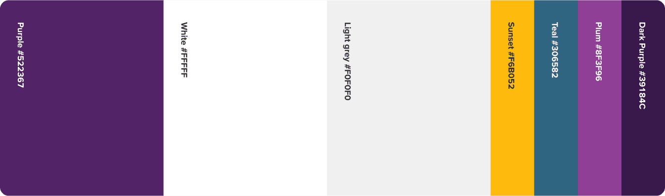
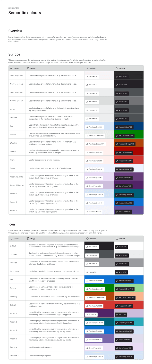
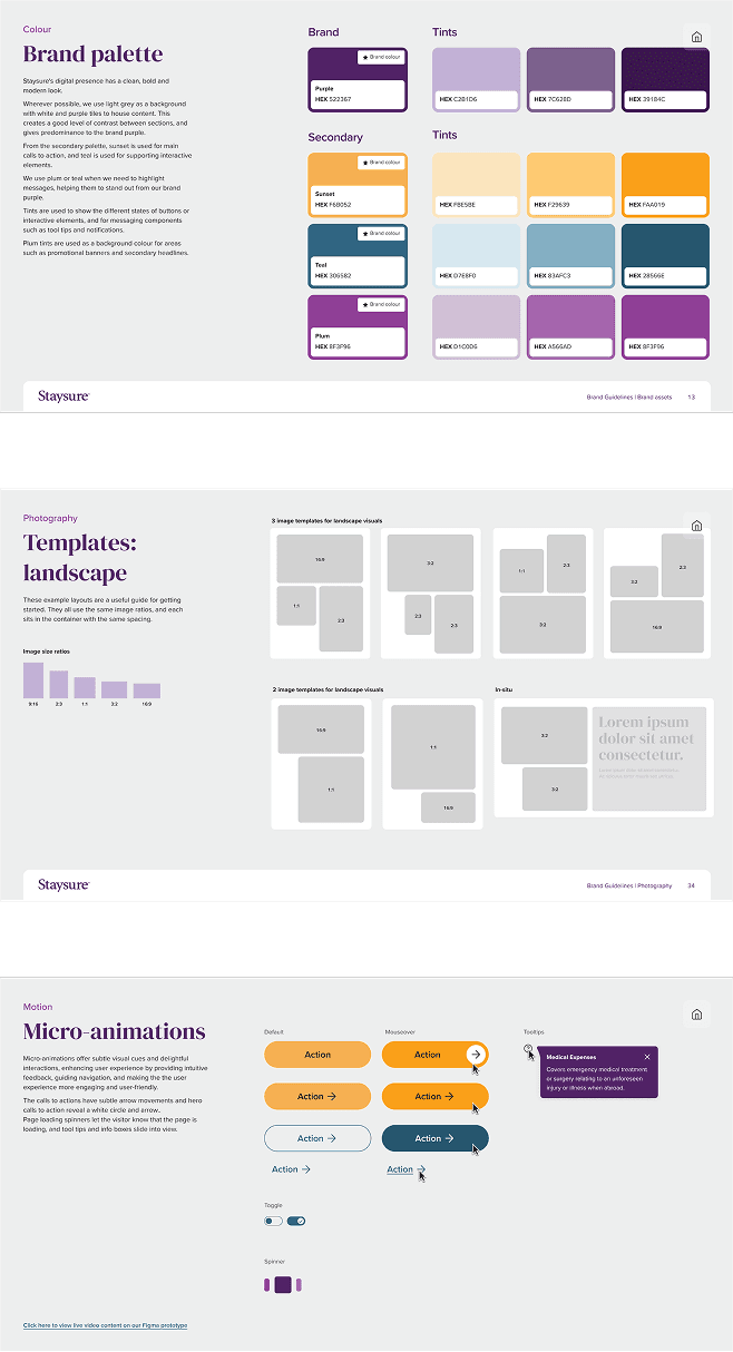
The main foundation of the project was a tokenised design syetem. Below you can see the foundations and semantic colour implementations. A new brand colour palette which tried to balance digital and accessibility. Purple white and grey were to be used as a foundtaion and then the secondary colours for interactive elements.
The main foundation of the project was a tokenised design syetem. Below you can see the foundations and semantic colour implementations. A new brand colour palette which tried to balance digital and accessibility. Purple white and grey were to be used as a foundtaion and then the secondary colours for interactive elements.
Semantic colours were assigned to every element in the design flow for easy updates in the future and to allow cohesion across the designs.
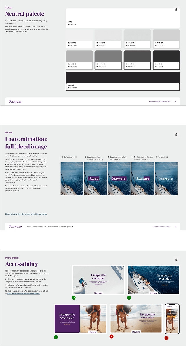
An extensive set of brand guidelines were created. This included brand foundations like colours, typefaces and logo usage, all the way to creating templates and rules around the tiles and content blocks.
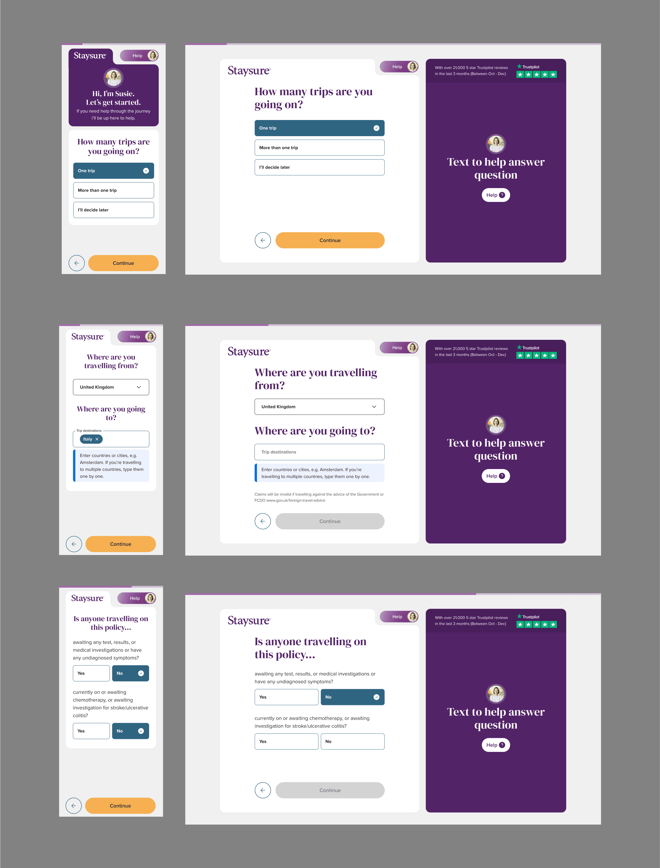
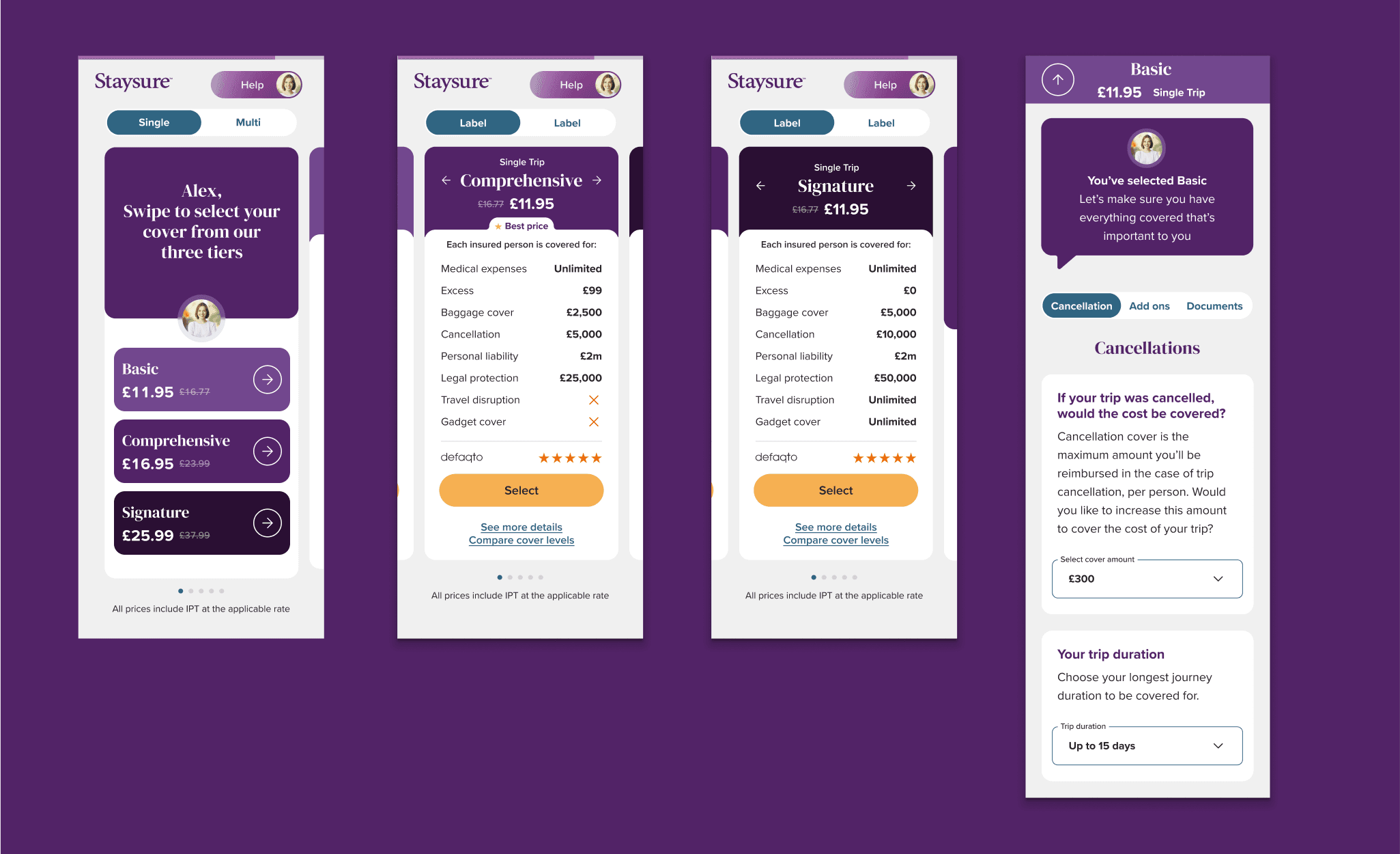
Once all the branding was in a good place. we designed the entire quote journey. We really tried to incorporate the rounded tiles and modern flow into our designs.