I was to lead the full website redesign for the Saudi Public Investment Fund (PIF).
The project began with two distinct design directions which i presented to the client, each reflecting a different visual direction. They both had to incorporate the brand colours which was the premium green, gold and black.
Agency
Agency
Agency
Wunderman Thompson
My role
My role
My role

Web designer, UI design

Web designer, UI design
Location & year
Location & year
Location & year
UK & Saudi Arabia, 2023
Route 1 on the left explored a more corporate feel with hard edges and a lighter colour tone. Route 2 on the right explored a more modern digital approach wigh rounded corners and tiled approach with a bold rounded font.
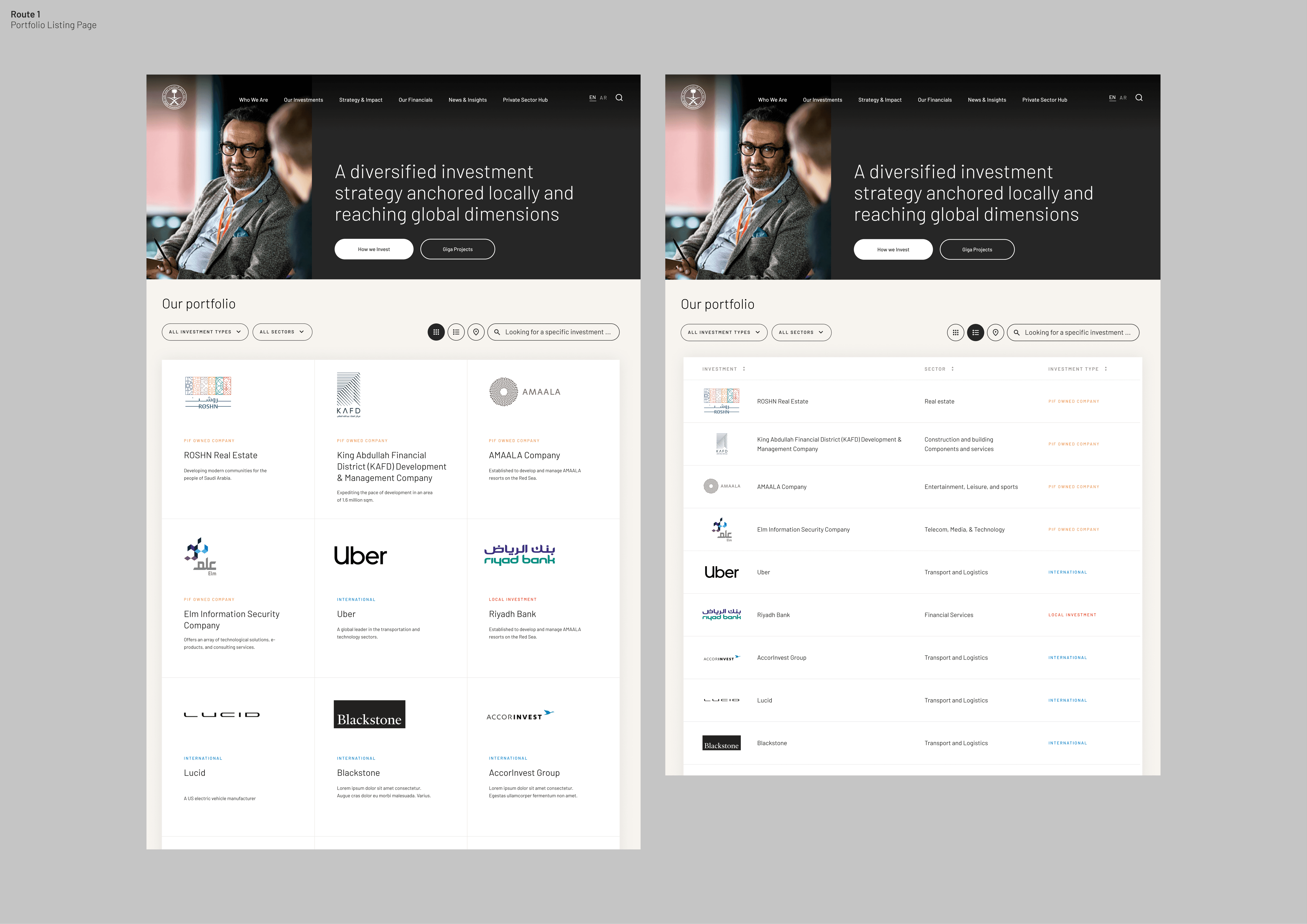
PIF wanted to present their investments in beautiful landing pages. This second route explored large images in a grid structure. I wanted the page to be filled with impactful imagery to guide the user down the page.

First challenge

I had to design a clean, modular component system and light-themed UI.

High profile client

With visibility at the highest levels of government including the Saudi royal family, there wa pressure for perfection.

Tight timeframe

The entire website had to be designed under a very short timeframe of just a few weeks. This required an agile workflow to ensure we delivered the website within deadline.

Exploring creativity in a corporate brand

Although the brand leaned corporate, I introduced subtle modern visual elements with modern layouts without overstepping brand boundaries.

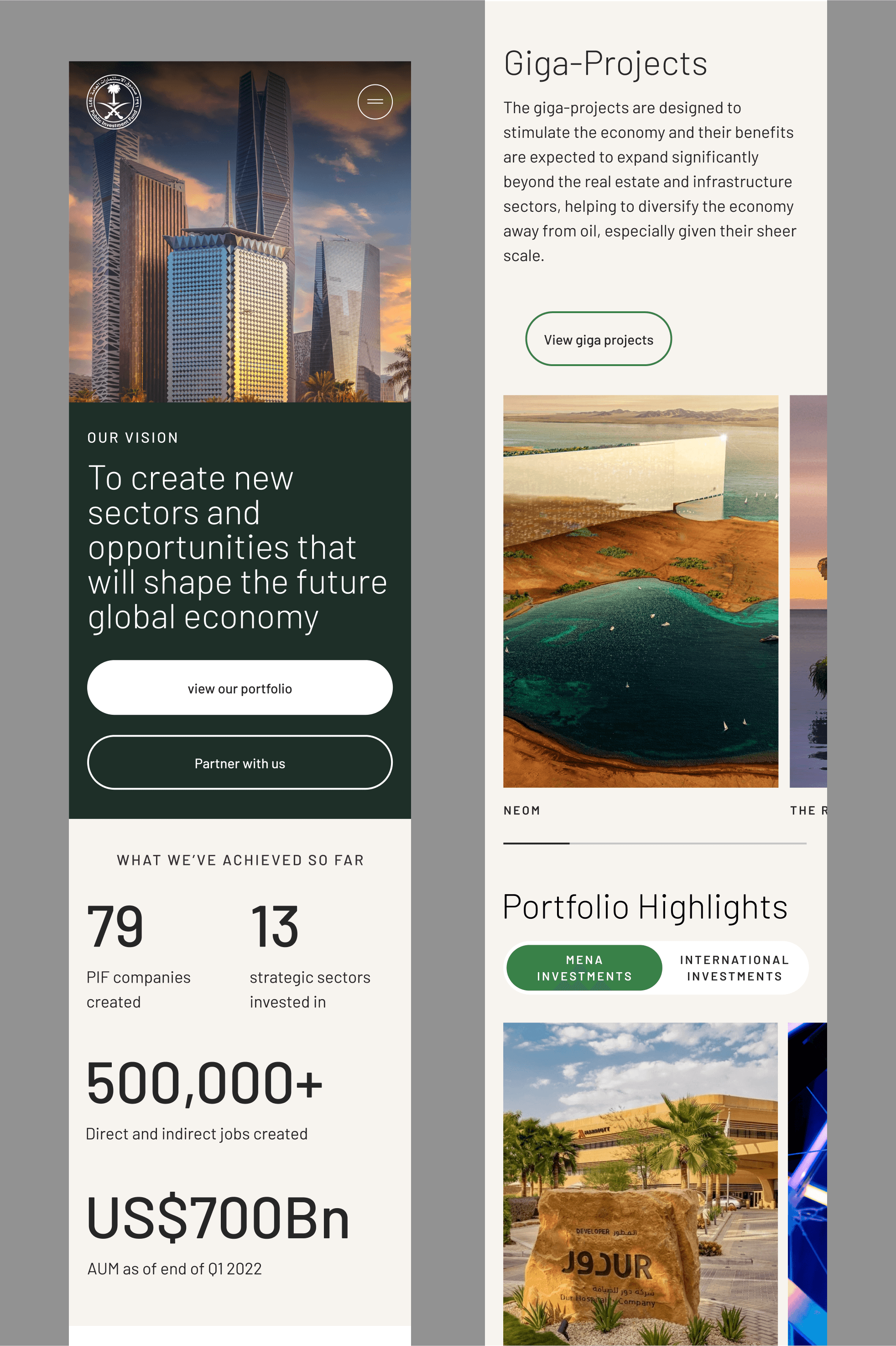
Modern and clean layouts. I wanted this site to feel bold. I wanted the images to hold the site with a nice bold typeface to make it feel less corporate.
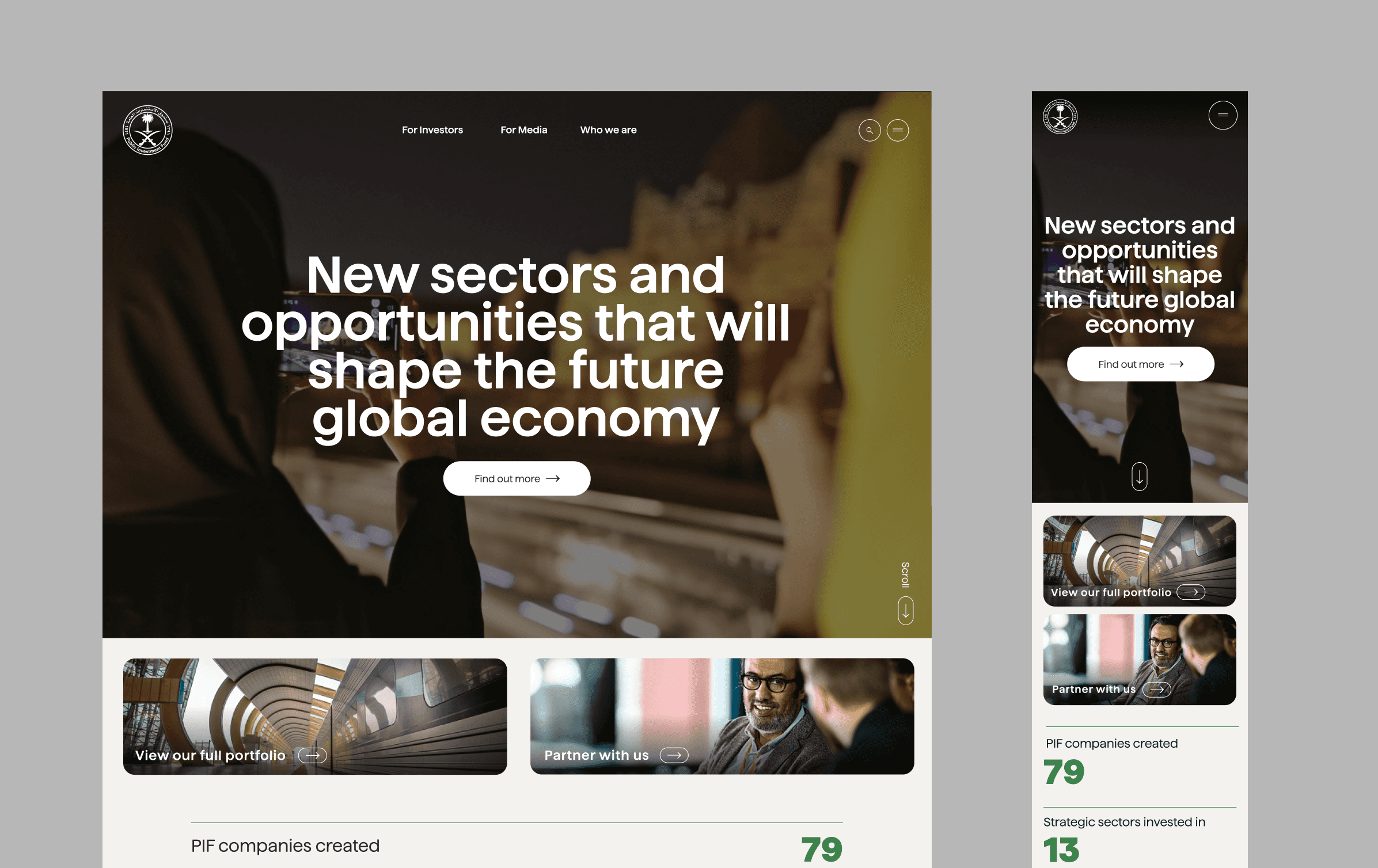
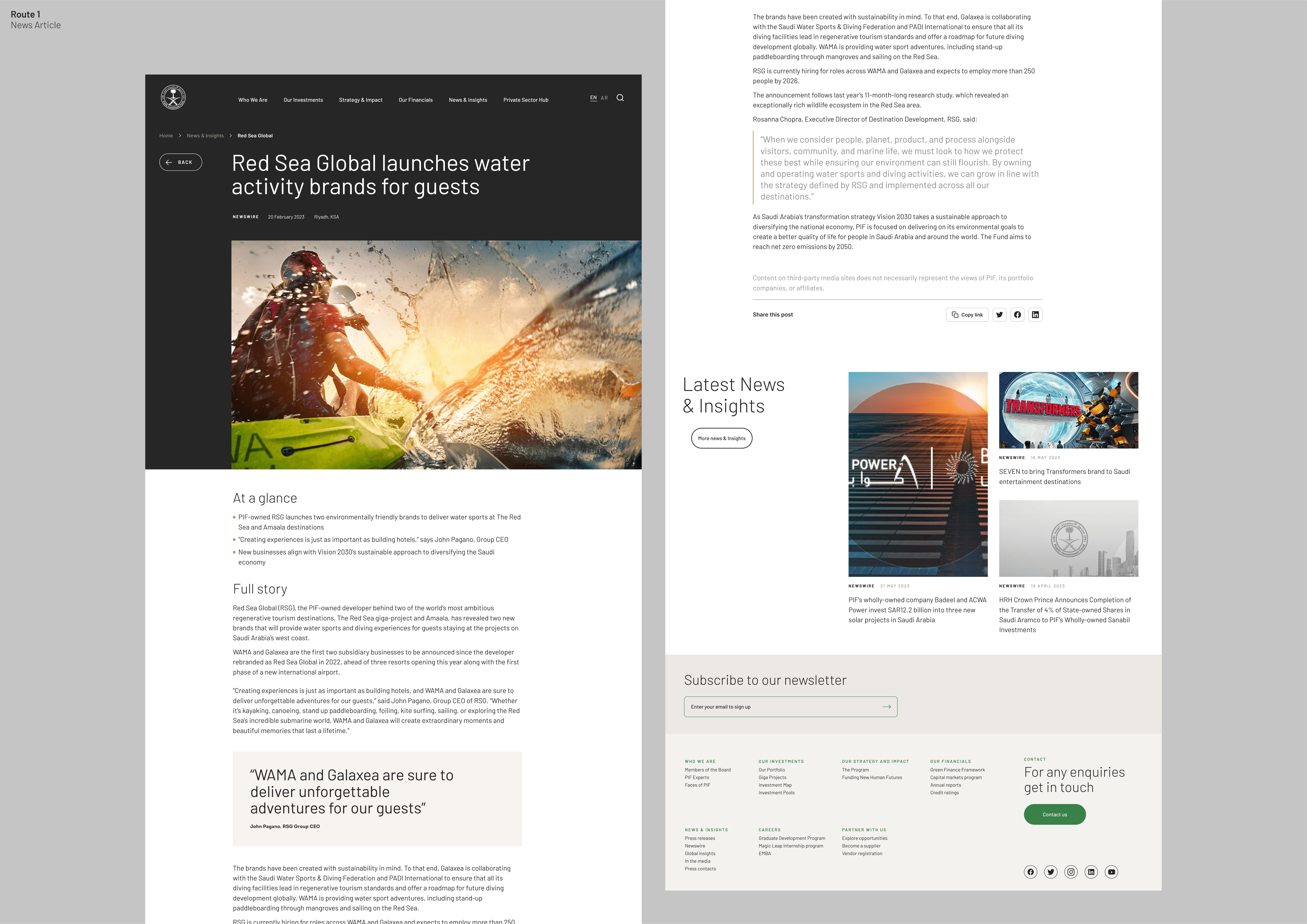
You can see the two routes together. Route 2 is more dark theme with full width imagery, whereas route 1 was softer with more varied layouts and mixed components.

Results & Impact

Key Design Skills

Key Design Skills

Route 1 was selected by client as it leant more towards the heritage of the brand. They liked the lighter theme and slightly more corporate feel. I think this was a nice choice to work with and the complex layouts would mean i had to try to make each page feel unique rather than just full with panels.

A clean, modern corporate look & feel

Each page used a complex set of layout components which made it not repetitive.

Scalable design foundation

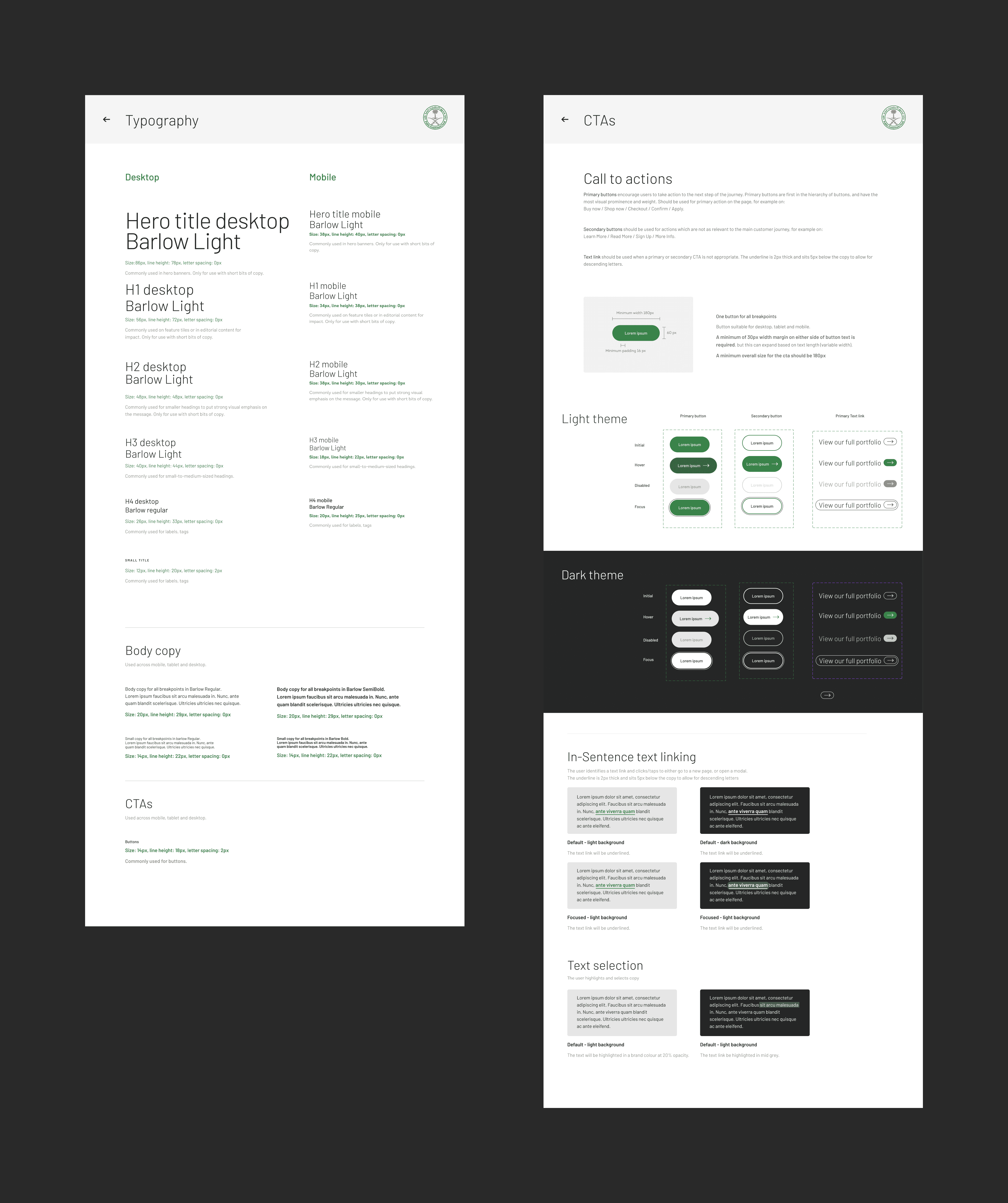
We created a foundation level design system to build the site with. This was so they could take the site in-house and continue with the build.

Client Satisfaction

The work received highly positive feedback and successfully passed internal approval, including presentation to members of the Saudi royal leadership.

Other internal pages included blogs, investment maps and lists as well as a collection of about pages.
Here is a quick look at the foundation level style guide. It wasn't as heavy as a full tokenised design system but still contained an atomic level system which could be scaled up when needed.
This redesign was a benchmark in designing for high-stakes global institutions, where digital precision, political sensitivity, and design quality all meet.